Thursday, April 17, 2014

Correlation matrix.


Correlation Matrix from PROC CORR
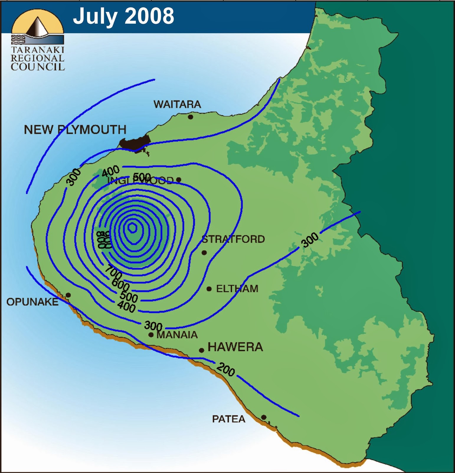
https://support.sas.com/documentation/cdl/en/statug/63033/HTML/default/viewer.htm#statug_ods_sect017.htm

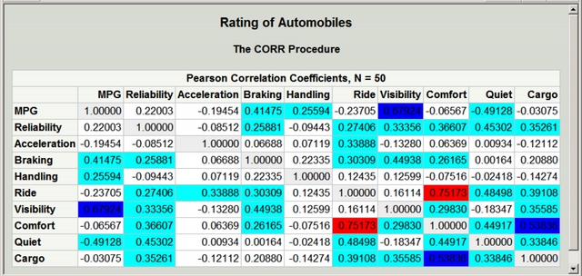
This graph displays the rating of automobiles in a correlation matrix. This displays the relationship between the rating of certain components of automobiles, displaying corresponding values under each column. Qualifying as a correlation matrix, it contains correlation coefficients among several markets in different timeframes.

Bivariate choropleth maps.

http://www.geo.unizh.ch/~annal/Choropleth%20maps.html

Bivariate choropleth maps combine two datasets into a single map allowing a graphical representation amongst a group. The map above displays different color representation showing the percentage of population under the age of 18. The map displays spatial distribution of the two groups, using the colors to distinguish accurately.

DRG Map


Digital Raster Graphic for Bushkill PAhttps://www.e-education.psu.edu/natureofgeoinfo/c6_p6.html

DRG maps are scanned raster images of USGS topographic maps. Above is a DRG map of Bushkill, PA, showing lakes rivers and streams with the use of contour lines to represent elevation. DRG maps are often used when other digital data is superimposed. therefore the accuracy of a vector file containing these lakes and rivers can be checked by plotting it over a DRG.

DLG Map.


http://www.mapcruzin.com/free-geodata-shapefiles/usgs-geospatial-data-geodata-geographic-download.htm

Above is a DLG map of a region with a scale of 1:24,000. DLG maps are line graph data with digital representations of cartographic information, with the use of digital vectors. The lines above are distinguished by different colors; a format that represents spatial data for the transfer between computer systems. 

DEM


DEM maps are a digital elevation model of a terrain's surface. This map shows the a DEM image of the Sahara desert, with the use of contour lines mapping out elevation levels amongst the desert's surface. DEM representations can include terrains of the Earth, Moon, asteroids, etc. DEM maps represent how accurate the elevation is, including factors such as terrain roughness, grid resolution, and vertical resolution. 

Isopleths Map


http://dwb4.unl.edu/Chem/CHEM869V/CHEM869VLinks/weather.about.com/newsissues/weather/library/weekly/aa071600a.htm

The map above displays hydrogen concentration as pH measurements made at field labs in 1998. The rainfall is collected and measured in terms of pH to determine the general effects of acid rain, along with SO4 and NO3 concentrations. With distribution across the U.S, it qualifies as an isopleth map due to it simplifying information about a region.

DOQQ Map


DOQQ maps are digital orthophoto quarter quadrangle maps created by the U.S Geological Survey. It is an aerial photo that has been pixelated alined with longitude and latitude lines. Above is a lap of Lake Travis, narrowly defining the lake's region, a technique used in DOQQ maps called rectification. 

Accumulative line graph or Lorenz curve.

http://edecon.wordpress.com/2011/06/

The Lorenz curve above displays the graphical relationship between the cumulative percentage of population and percentage of income. Lorenz curves represent the cumulative function distribution of the probability of wealth, while the graph above displays a 45 degree line representing equality. The graph above shows an unequal distribution of income, with the lorenz curve dipping under the equality line. 

Isopach Map


The map above displays the Rio Blanco tephra, which erupted from the active crater. The tephra has deposits ranging in thickness a few centimeters from the crater. Isopach maps illustrate thickness variations, with equal representations over the area. The deposits from crater include plagioclase, orthopyroxene and hornblende. 

Classed choropleth maps.

http://my.ilstu.edu/~jrcarter/Geo204/Choro/

The map above displays the ratio of the amount of males in North America, including Puerto Rico, compared to the number of females. Classed choropeth maps do not tell exact values but map aggregate regions, in which the map above aggregates states into categories with dark to light shaded regions. 

Continuously variable proportional circle map.

https://www.e-education.psu.edu/geog486/book/export/html/1796Minard's proportional symbol map
Continuously variable proportional maps represent the distribution of a certain amount of variables and how they're proportioned throughout a region. The numbers in these types of maps are not quantized and often have different color circles for accurate representation. The map above shows each circle representing the proportion of different types of meat sent to Paris from France. 

Isotachs


This map represents gust speeds across the U.S. The map displays linear interpolation between wind speed contours and contours representing the wind speed of coastal area. An isotach map displays a region represented with contour lines to show wind speeds, as does the graph above. 

Isobars

The map above is an isobar map representation of North America. The contour lines are used to represent areas where the atmospheric pressure is the same. With lines being closer together where there is more rapid changes, the map above shows the most pressure changes in the southeast and northwest regions.

Lidar


This map is displaying the Cordova, South Carolina area. The difference colors represent elevation, showing the dark blue hill 95 meters below sea level. Lidar maps are for light detection and ranging, which uses a lidar for remote sensing of a certain area. The area above uses lidar mapping applications to display Cordova.

Unclassed choropleth maps.

http://www.mapresso.com/
Unclassed choropleth maps use continuous tone schemes, with a region containing a specific color value. The map shows above shows a class boundary with two separate color transitions. Like an unclassed choropleth map, this map doesn't use average statistical data.

Univariate choropleth maps.


http://en.wikipedia.org/wiki/Thematic_map

Univariate choropleth map is a type of thematic map, which only displays the data as one single variable. Univariate maps display the data across a certain area of region. The map above displays the amount of water use in the U.S. 

Black & white aerial photo


http://www.theradionetwork.net/content/aerial-photography-over-green-river

This photo is an aerial shot of The City of Green River, by a Cessna aircraft flying over the city. When doing aerial photography, many people use infrared with a black and white tint. Many use this aspect to block blue wavelengths and allow infrared to pass through. This shot might have been taken from a military aircraft, whom often use black and white aerial photography when flying.

Unstandardized choropleth maps.

http://eps.mq.edu.au/courses/GEOS219/choropleth.htm
Unstandardized choropleth maps display data sets of raw numbers, rarely averaging data. In the map above, a region is expressed by displaying the number of deaths of persons under one year. The colors represent exact amounts for each region, dark red being a larger amount then white. 

Triangular plot.

ternary diagram plutonic igneous rockshttp://www.waterproofpaper.com/graph-paper/ternary-diagram-triangular-graph-paper.shtml

This plot displays points at the composition of 50% quartz, 40% alkali feldspar and 10% plagioclase. This qualifies as a triangular plot due to having three variables that sum to a constant. All three minerals sum to make the composition of granitoid. 

Cartographic Animation Maps


This map is a cartoon like representation of the U.S, capturing viewers attention with its highlighted blue depiction and use of bright diamond like points. The map's appearance qualifies it as an animation map, for it has a profound effect on the representation of the area due to its exaggerated features that catches the viewers' eye. 

Bilateral graph.

http://seekingalpha.com/article/241440-will-octobers-improved-trade-deficit-continue

This map represents the U.S. Trade Deficit between 2009 and 2010, displaying points displaying billions of dollars at each corresponding month. This qualifies as a bilateral map due to it representing more than one variable (both years 2009 and 2010)

Choropleth Map


http://www.colocarto.com/custom-thematic-maps
This map displays the estimated median household income in the U.S. The dark red portions display homes with higher income while the lighter with lower incomes. This qualifies as a Choropleth map due to the areas being shaded in proportion to the measurement of the statistical data.

Nominal area choropleth map.

http://my.ilstu.edu/~jrcarter/Geo204/Choro/Tom/

This map shows the percent of persons who are hispanic or Latino in Florida by county. The data is divided into quartiles that show a certain number of groups, where each group has the same number of counties. This qualifies as a nominal area chloropeth map due to its representation of nominal data measured in amounts but no actual value. 

Standardized choropleth maps.

http://www.directionsmag.com/articles/choropleth-mapping-with-exploratory-data-analysis/123579
This map displays population density amongst an area with different color representation. With a scale of 0-20 kilometers, the darkest colors represent the denser areas. This qualifies as standardized chloropleth due to it representing averaged data in order to compare areas of different sizes. 

Statistical Maps


Matrix.net map - click for larger imagehttp://personalpages.manchester.ac.uk/staff/m.dodge/cybergeography/atlas/census.html
This map displays the growth rates of the internet in Africa from July 1995-1996. The maps shows percentage increase, decrease, and no change amongst the continent. This qualifies as a statistical map due to the variation in quantity (internet percentage) amongst a certain geographic area.

Flow Map

http://www.spatialdatamining.org/software/flowmap


The figure above portrays a flow map. Usually including a map and chart, the figure shows a specific movement across the United States from California. Often associated with wind patterns, flow maps can also be used for migration, or any example of the movement of objects. 

Isoline Maps

This map displays temperature differences amongst the united states, using color representation to show the hottest areas red and cold areas blue. Isoline maps display continuous lines jointing points of the same value; the map above is using using areas that have the same temperature value.

Proportional Circle Map

http://www.neiu.edu/~isp/maps_gis.html

The map above displays the comparison of current students attending classes at NIU in the Illinois area in 2011 to the current alumni in the same area. This accurately portrays a proportional circle map due to the fact that the information is scaled and distributed in circles. Proportional circle maps are beneficial for displaying populations in large masses. 

Isohyets

This map represents rainfall in New Plymouth, with contours representing isohyets showing the month's rainfall in 100m bands. Isohyet maps are represented by contour lines mapping rainfall, as to which this map represents equal rainfall amongst the region. 

Infrared aerial photo

The map above is an areal documentation of the Sacramento River Deep Water Ship Channel and Leeves Prospect Slough. With different color representation, the area can be thermographically displayed with the use of infrared imagining to show temperature differences. Areal photographs often document changes to the environment, health of forests and also monitor contamination levels in these environments.

Cartogram Map

Above is a cartogram map showing the world-wide distribution of the 2012 summer olypmic medals in relation to age. The colors from dark to light represent oldest age to youngest receivers of medals. This qualifies as a cartogram map due to it presenting statistical data in geographical distribution amongst a certain population.

Doppler Radar


Above is a doppler radar map showing Clark County Kentucky. The image displays the storm-relative velocity along with mesocyclone elevation of supercells over southern Washington. This qualifies as a doppler radar due to the info producing velocity data about the county at a distance.

Wednesday, April 16, 2014

Index value plot.

http://www.muhlenkamp.com/investment/principles/whats_the_new_normal_economics_rules_markets

The map above displays the ISM Non-Manufacturing Index over a span of twelve years. The "50" marks a median for the graph and shows the decline in between the years 2001-2002 and 2008 and 2009. Instead of giving an absolute value this map gives a comparison which allows you to base your values and conclusions on, accurately making this a Index Value Plot. 

Dot Distribution

http://www.potaroo.net/ipj/figures/dnsv/dns_visual.html

Parallel coordinate graph.


This accurately displays the relationship upon cylinders, horsepower, mpg, weight and year of automobiles. This expresses a parallel coordinate graph due to its unorthodox plotting. Displaying statistical data on specific visual points these graphs have three important features being the rotation, the order, and the precision of the axis. 

Star plots.

Fig1

Stem and leaf plot.

table#1.gif (6324 bytes)http://mainland.cctt.org/mathsummer/josephbond/stemandplots/stem-and-leaf_std.htm

This displays a stem and leaf plot of the Capita GNP in Western Africa. Displaying an overview of data briefly, the stem is displayed on the left showing the tens digits while the plot is the right displaying the ones digits. This accurately describes a stem and leaf plot because both the stem and leaf correspond to the information given in the table. 

Histogram.

http://matplotlib.org/examples/pylab_examples/histogram_demo_extended.html

This graph accurately describes a histogram. It's an obvious visual representation of data distribution in large amounts. With information on both the X and Y axis', the graph usually displays a variable increase, decrease, or relativity.

Propaganda Map

http://nationalatlas.gov/articles/boundaries/a_plss.html

The map above accurately portrays a propaganda map. Although most propaganda maps are usually fictional some can display non-fictional events also. Having a majority of symbolization, these maps are also heavily favored for a political stand point. 


Tuesday, April 15, 2014

Similarity matrix.

http://spie.org/x48704.xml?pf=true&ArticleID=x48704

The map above portrays a similarity matrix showing cross-correlation coefficients among drug responses. The diagonal like red boxes portray groups of similar responses from each drug. This qualifies as a similarity matrix due to the data measuring the similarity between each drug point in a graphical series. 

Planimetric Map


This map displays the detail of 1853 Wyoming county. This map displays township boundaries, roads, towns and villages, and names of landowners. This qualifies as a planimetric map for the reason that the features on the map are displayed horizontally without elevation.

Sunday, April 13, 2014

Box plot.


http://www.arm.gov/science/highlights/RMjUx/view

The map above is displaying the average aerosol optical depth (AOD) over a period of time. The solid black line represents the average AOD for the year while the red dotted line represents the mean values for the year. This accurately qualifies as a box plot due to the fact that it accurately depicts groups of numerical data through quarterlies. 

Windrose.


This map accurately depicts the wind speeds and wind directions in an area. The various colors represent wind speeds displaying light blue as light winds and black as devastating winds. This accurately qualifies as a windrose because it shows wind direction in the area, and also wind speed.  


Cadastral Map


This map accurately represents a cadastral map by displaying different properties in relation to the community. This qualifies as a cadastral map due to the fact that it includes a precise location and different dimensions of the area with individual parcels of land. 

Plss Map


The map above is a PLSS map of the united states, dividing each state into town meridians with the use of base lines. It qualifies as a PLSS map due to each townships being surveyed north, south, east and west from a certain point. The township designations indicate the location north or south of the baseline, while the range designations indicate the location east or west of the principle meridian. 

Thematic Map


This map displays world life expectancies, with countries shaded different colors representing the average lifespan of persons. This qualifies as a Thematic Map due to the distribution of colors throughout the map representing life expectancy specifically on boundary like terms (contrasting by continents)

Scatterplot.

../_images/cmap_scatter_plot.png

http://docs.enthought.com/chaco/user_manual/plot_types.html

This map is showing a relationship between median house prices and the percent of lower status in the population of a certain area. The different colors represent nitric oxide concentration, displaying green as low and red as high. This qualifies as a scatterplot due to the data showing a collection of points, each having a variable determining the position on the horizontal (lower status of population) and another on the vertical axis (median house price). 

Topographic Map


This topographic map displays the vicinity of Springdale, Utah and Park headquarters. The topographic relief is shown in brown, which represents the configuration of the contour lines that display hills, mountains and other land forms. This qualifies as a topographic map due to its contour lines plotting the different elevation changes of each landform, connecting points with similar elevation values. 

Climograph.

http://oldclimate.gi.alaska.edu/Climate/Climographs/ANC.html

The map above is displaying the mean monthly maximum and minimum temperature and total precipitation from the year 1971 to 2000 for Anchorage, Arkansas. The red lines plot the maximum precipitation and blue lines are plotting the minimum in relation to temperature. This qualifies as a climograph due to the map representing basic climatic parameters on a monthly average,with a relationship between temperature and precipitation. Many climographs, such as this, use an overlapped combination of a bar and line chart to show the changes amongst the months.

Population profile.

http://camellia.shc.edu/literacy/tablesversion/assignments/statisticsassign.htm


This map conveys the population profile for Mobile county, dividing the population into two groups based on gender and age. The x and y axes display contrasting values, showing the division of age into increments of 4 years on the y-axis and percentages of each age class to the total population on the x-axis. This map qualifies as a population profile due to its ability to demonstrate the effects of how population changes with age, showing the effects of mortality and migration on each gender's population.